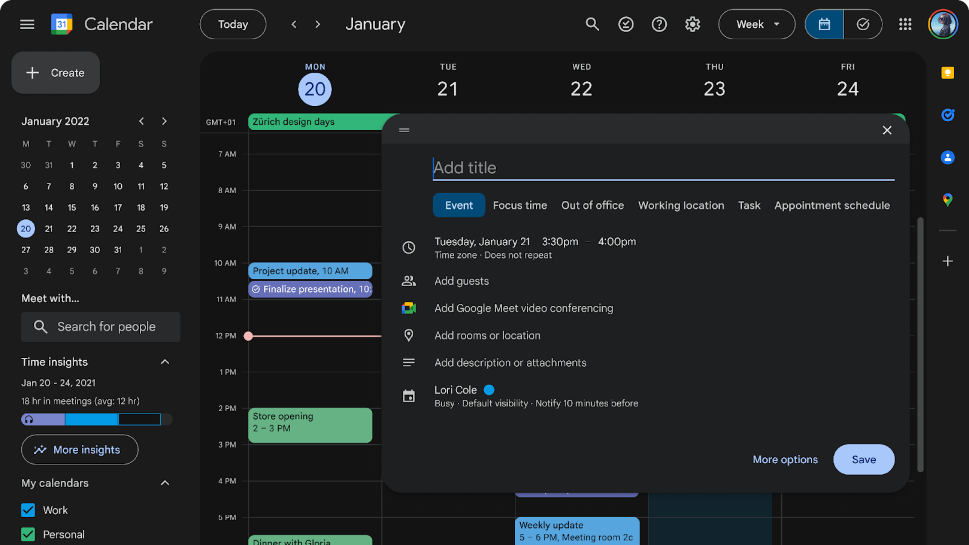
The changes include a new dark mode.

Credit: Google
Google Calendar is getting a refresh: new Material 3 updates are rolling out to Google users in the next few months, bringing the app’s design in line with others like Gmail and Drive. Material 3 is the latest iteration of Google’s open-source design language, which has also adaptive components that adjust your icons, settings, and other UI elements to match a selected color scheme.
In addition to rounded corners and grey top and sidebars, Material 3 changes to Google Calendar include the following:
-
Modernized, accessible buttons, dialogs, and sidebars
-
Typography with Google’s custom design
-
Fresh—”legible and crisp”—iconography
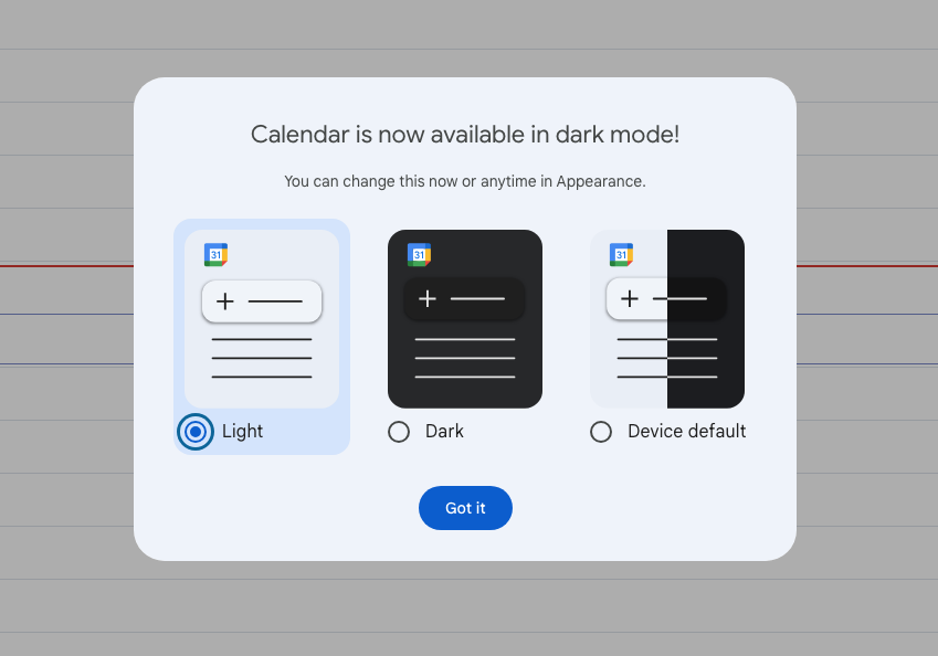
Calendar is also getting a dark mode so users can choose between light, dark, or the device default. According to Google, these updates will be consistent across Calendar on the web, including the task list view.
The redesign will be available to Google Workspace customers, Workspace Individual subscribers, and those with personal Google accounts. If you don’t see the changes just yet, don’t worry—Google says they will be pushed to Rapid Release domains in the next two weeks and to other users in an extended rollout beginning on Dec. 2.
If you want to switch your calendar to dark mode once you receive the update, go to Settings > Appearance and select Light, Dark, or Device default.
Lifehacker has been a go-to source of tech help and life advice since 2005. Our mission is to offer reliable tech help and credible, practical, science-based life advice to help you live better.
© 2001-2024 Ziff Davis, LLC., A ZIFF DAVIS COMPANY. ALL RIGHTS RESERVED.
Lifehacker is a federally registered trademark of Ziff Davis and may not be used by third parties without explicit permission. The display of third-party trademarks and trade names on this site does not necessarily indicate
any affiliation or the
endorsement of Lifehacker. If you click an affiliate link and buy a product or service, we may be paid a fee by that merchant.
