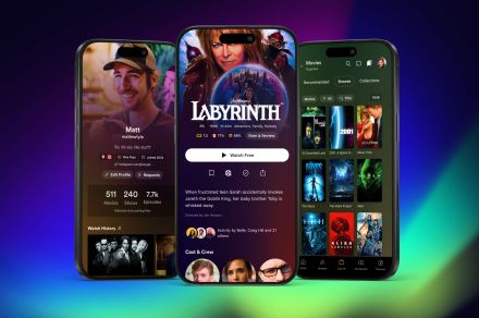
Plex is redesigning almost every aspect of its user experience. But instead of dropping the new Plex on unsuspecting customers, with no way back to the previous version, users can opt in to be part of a preview beta community so they can see, use, and comment on the new version before it becomes the only version. More importantly, they can continue to use the existing version at the same time.
The new Plex will spend the next few months in beta as a mobile-only experience. A full rollout will follow in early 2025 to all of the many platforms that Plex currently supports.
This approach is in stark contrast to the disastrous rollout of the redesigned Sonos app, which landed automatically on people’s phones and contained a huge list of bugs and missing features. Sonos never offered a way for its customers to roll back to a previous version, and more than six months after the botched update, the company is still recovering.

In a sign that Plex has taken careful note of Sonos’ customer backlash, it’s being very clear with what beta members can expect. “We recommend spending some time with the new app — a week or two, or even three. It’s important to note that this initial release will be missing a few features (e.g., playlists and cast support), but we will continue closing those gaps throughout the preview period.”
Related:
- I ditched streaming for a Plex server. I’m never going back
- Influence what your friends watch with Plex user reviews
- Plex is now in the movie rental business, with a catch or two
Plex says the new design accomplishes two major goals: improving the experience for users and making it much faster and easier for the company to roll out future updates.
For its users, the company wants to provide “a global community where everyone can discover, experience, and share all of the entertainment that matters to them,” according to a Plex blog post on the launch.
In the context of the new design, that means navigation that makes it easier to access different parts of Plex and discover content. “We’ve brought our core features to the forefront, saying goodbye to the days of hidden hamburger menus and making it easier to explore with one hand on your phone.”

Apparently, the company’s testing shows that this has helped both existing and new users get the most out of the platform. Advanced Plexers should also find a lot to like: media libraries have been centralized into a dedicated tab, with the option to favorite libraries and access power-user features.
The new look is fresh and very reminiscent of the designs favored by top streaming services like Netflix and Disney+.
The Watchlist, one of the more recent additions to Plex, has become very popular with users, according to the company, so it gets its own dedicated spot in the top navigation area for faster, easier access. The user menu has also received a rethink. You can now access your profile, watch history, friends, and streaming services in one place.
But perhaps the biggest change, visually speaking, is the expanded use of artwork. It shows up throughout the app, but is most noticeable in movie and show detail pages, cast and crew profiles, and personal profile pages. Title artwork has also been added for movies and shows where available, something Plex says has been a longtime user request.
While parts of the new Plex will be familiar, the apps are actually built on brand new code. “We made the significant decision to rewrite our apps from the ground up and unify our codebase.” Most folks who don’t work on the Plex development team won’t care about that, but they’ll still benefit from the move: “The boost to our development speed has been incredible, and should enable us to bring new features to you more efficiently across more platforms, with much higher quality than ever before.”
And who doesn’t want cool new stuff faster, especially when it works?
